

A LabKitty Primer is an introduction to some technical topic I am smitten with. They differ from most primers as to the degree of mathematical blasphemy on display. I gloss over details aplenty and mostly work only the simplest cases. I show mistakes and dead ends and things any normal person would try that don't work. Also, there's probably a swear word or two. Mostly I want to get you, too, excited about the topic, perhaps enough to get you motivated to learn it properly. And, just maybe, my little irreverent introduction might help you understand a more sober treatment when the time comes.
Mathozoids describe the General Linear Model (GLM) as, well, a general linear model, one that combines regression and ANOVA into a unified whole. Those words aren't particularly helpful in explaining the thing, especially if you're coming to GLM for the first time. Heck, it took me a month just to understand there is also a GeneraliZED Linear Model which is something different (sort of) even though it generally goes by the same abbreviation.
But I had an epiphany the other midnight about a different way of explaining GLM, a way that has little to do with combining regression and ANOVA into a unified whole and which the beginner might find to be a more approachable inroad. At first glance, my way may seem like more work because I will ask you to think about other analysis tools that have little to do with statistics. I encourage you to resist this reaction. For we will not discuss the details of these other methods, only their character -- their "data philosophy," if you will. Once you see how GLM fits into the big picture, all else will follow. We'll construct a few simple models, consider the briefest derivation of the underlying equations, review statistical testing, and have a look at some Matlab code. As usual, I'll finish up with a few leads into the literature.
For your part, you'll need to recall a little matrix algebra and enough statistics to know what regression and ANOVA are. You'll also need to surrender your old statistics worldview for the new vista GLM offers. It's natural to resist taking such a leap -- your old worldview may have been acquired through much classroom effort and pain. However, embrace GLM and no longer will you look upon statistics as a collection of disjoint topics, each with its own ad hoc nomenclature, recipes, and purpose. Instead, look upon the One True Statistics, like some being provoked out of the absolute rock and set nameless and at no remove from its own loomings to wander the brutal wastes of Gondwanaland in a time before nomenclature was and each was all. GLM is just that cool.
As has been said of Mordor, a root canal, and puberty, the only way around it is through it. And so your journey begins now.
The problem in a nutshell: We have data. We have reason to believe our data is really a sum of a bunch of other waveforms, the members of this collection being a) simpler or b) having a useful physical interpretation or c) both. We seek an algorithm we can feed our data to and out pops the collection.
Consider the classic example of such an algorithm: the Fourier transform. I have previously written two primers on Fourier analysis (linky, linky), and although your clicks are what keeps the lights on here at LabKitty, I don't recommend you pause and go read them. Not now. There is a great deal of detail provided in these primers we do not need presently. Indeed, what we need presently is not much more than a picture.
Here's a picture of a simple Fourier decomposition:

The top panel shows the data, and the two panels below show a cosine and a sine Fourier tells us make up the data. By "make up the data," I mean if we were to multiply the cosine and the sine by their respective weights and add them together, we would obtain the waveform shown in red. That is, data = weight-1 ⋅ component-1 + weight-2 ⋅ component-2. The math behind all this doesn't interest us today -- indeed, we'll be throwing Fourier under the bus momentarily.
In what follows, I need a way to refer to the collection of functions the data gets decomposed into. I'm going to use the standard math terminology basis function. We say the basis functions in Fourier analysis are sinusoids. We feed it data, and out pops a collection of sines and cosines (aka "sinusoids").
The crux of the story is that Fourier decided for us what basis functions to use. Yes, in some larger sense, we decided to use sinusoids by choosing Fourier analysis. But after that, Fourier was in the driver's seat. In effect, the algorithm says: I decided this weighted combination of these basis functions best fits your data. If you don't like them, tough kittens.
Sometimes such an approach makes a great deal of sense. We might know our data is a sinusoidal signal buried in noise. We select Fourier analysis because we know Fourier looks for sinusoids.
However, consider a different situation: Suppose we have some idea of the signal(s) that are present in the data before we begin. Suppose said signals aren't sinusoids. For example, suppose our data looks like a square wave. Here's what Fourier would do to us:

(I've changed a few things in this figure compared to the previous one: 1) I'm now plotting the data as discrete points rather than as a continuous curve because that's the type of data we typically encounter in GLM. 2) I've added a bit of random noise to the data, because that's the type of data we typically encounter in GLM. 3) I'm plotting all the Fourier components in one panel (because there's several dozen in this example). I've already applied the weights (so you can see them better). 4) I superimpose the sum of the sinusoids (what we'll call the model) on top of the data in the bottom plot, to give you a sense of how well the model fits the data.)
Although it's kinda impressive that Fourier synthesized a square wave out of sinusoids, it's also kinda redonkulous to whip up a big batch sinusoids to model something that isn't really sinewavy. Sure, we could have used a different tool that uses a different kind of basis function. You may know some of them. The Laplace transform uses decaying sinusoids as basis functions. Wavelets use wavelets. Principal component analysis uses arbitrary waveforms. But in each of these, the algorithm is in the driver's seat. We seek a different kind of tool: We pick the basis functions; all we need is the fit -- the weights.
That's what GLM is all about.
If you know linear regression, you already know one example of GLM. In linear regression, we decide the basis function is a line. The algorithm returns the slope of the line (i.e., the weight of the basis function) that best fits the data. If we don't want the line to pass through the origin, two basis functions are required: a line and a constant function. The algorithm returns two weights: a slope and a y-intercept.
Moving on, we can do regression in multiple dimensions -- we get a slope in each. Alternatively, we can use basis functions that aren't lines. We can fit a parabola to the data. Or a cubic. Or a sine wave. Or a spline. Heck, we can mix and match if we like. We might even use software to generate custom basis functions (a topic we shall return to later). The glory of GLM is if you define a basis function, GLM will use it. Think of the General Linear Model as the bottom feeder of statistics. A garbage disposal. It will eat anything you stuff down its face.
The best way to nail down this mess is to look at some examples.
Some Examples
Below, I present a few simple models generated by a little GLM algorithm I implemented in Matlab (I'll provide the code later). In each figure, the top panel shows the data, the middle few panels are the basis functions I told GLM to use, and the bottom panel is the model (i.e., the weighted sum of the basis functions) superimposed on the data (data in red, model in blue).
The titles list the weight and computed t- and p-values used to test the statistical significance of the weight (we'll discuss statistical testing in a bit). The title of the bottom panel includes the residual (= the sum of the square of the difference between the model and the data) and the model degrees of freedom -- these values will be useful later.
Footnote: By convention, weights are indicated in GLM using the Greek letter β. I'll use "weight" and "beta" and "β" and "β weight" interchangeably. Later, we'll collect all the weights into a vector, and I'll use (boldface) β to refer to a vector of all weights in a given model, and β (or βk) to refer to an individual weight.
I scolded Fourier with a square wave, so let's begin our GLM examples with one. The data here is similar to that used in the second Fourier example. I specified a square wave as a basis function, then let GLM do its thing:

The bottom panel shows nice agreement between the model and the data. To be clear, I supplied the square wave. I told GLM: use this. I used what we were looking for in the data to model what we were looking for in data. Is that cheating? No, it is not. There is no cheating in GLM. There are no rules in GLM. You give it basis functions; it gives you a fitted model. End. Of. Story.

In example 2, the data are samples of a square wave plus an offset plus a linear trend plus a little noise. Assume the signal of interest is still the square wave. Assume the offset and linear trend are just some annoying instrument weirdness. I included a basis function to model each of them, even though I just admitted they're not the signal of interest. In GLM, this trick is called including nuisance regressors (statisticos use the term "regressor" and not "basis function"). The value of a (good) nuisance regressor is that it improves the model fit and makes the residual smaller (compare next example). As we shall see, the size of the residual affects whether the weights are statistically significant.
Footnote: In what follows, I will use the terms "regressor" and "basis function" interchangeably.

Example 3 has same kind of data as example 2, but I have omitted the linear trend as a regressor. As a result, the fit of the model is poorer, reflected in the larger residual and a concomitant smaller t-value for the regressors I did include.

Example 4 demonstrates that GLM isn't magic. It does the best it can with what you give it. The data is similar to that used in the previous two examples, but I supplied a sine and a cosine as regressors. As you might expect, the model fit is poor. If you specify basis functions that are truly in the data, all is well. If you don't, the results may be unhelpful or meaningless or downright bizarre. That's not GLM's fault; that's your fault for feeding it bad intel. Play stupid games, win stupid prizes.
Footnote: Yes, in this example I obviously chose bad regressors. However, in the real world things are not always so obvious. We'll discuss inspiration for picking good regressors in a later section.
Example 5 is linear regression, GLM style. The data is a collection of (x,y) points; we seek to fit a line through it. The basis functions are a line and a constant function. The results look a little more like typical linear regression if I plot them 2x2 rather than 4x1 to make the panels square, so I did a second model and plotted it 2x2:

I've specified the basis functions as having slope one and a constant value of one. I could have used any values -- all it would change is the value of the weights. For example, specifying a slope of two for the first basis function would halve the first weight, and specifying a slope of one-half would double it. Sometimes this comes back to bite you -- for example when comparing results across two different analyses. Stay frosty.

In the introduction, I described GLM as combining regression and ANOVA into a unified whole. Example 6 demonstrates my claim. It's a t-test, GLM style, and what is a t-test if not an ANOVA with only two groups? Still, I suspect this looks like no t-test you have ever seen. You probably expect t-test data plotted as a bar graph, with the height and error bar representing the mean and variability of each group. When using GLM, we wrassle t-test data into a contrived time-series format.
Here's the idea: Picture collecting data for your study. Each day, you add another sample to the data, and mark a "1" or a "2" in your notebook to indicate whether the data came from a group-1 subject or group-2 subject. (Add a zero to the data and in your notebook if no data were collected on a given day.) When you are done collecting data, convert your notebook of 0s and 1s and 2s into two indicator vectors. Entries in the first indicator vector are equal to one on days you collected data from a group-1 subject and zero otherwise. Entries in the second indicator vector are equal to one on days you collected data from a group-2 subject and zero otherwise. Those are your basis functions. Feed them (and the data) to GLM.
GLM don't care that the basis functions look funky, it just fits them. Viola! We obtain the model shown in the bottom panel, and t-test statistics to go with it. I've defined the data in this example so that the group-2 treatment creates a larger effect than the group-1 treatment. But the data are also noisy. Is the effect significant? The numbers say YES. We'll get to statistical testing soon.
Footnote: I use Matlab's "stem plot" function here because the results look nicer for indicator-type regressors.

Here's the t-test again, except I sorted the data to make it look a little more like a traditional t-test. I put all of group-1 in the first half of data and all of group-2 in the second half. If you squint, the stem plots look like two bar graphs. This is probably how you expect to see t-test data plotted (all that is missing are error bars).

If two groups gets us a t-test, then more than two groups must be ANOVA. And so it is. Example 7 is one-factor ANOVA, GLM style. Assume the data represents an effect measured in three different treatment groups. I provide a basis function for each. We obtain the model shown in the bottom panel, and statistics to go with it. The results look similar to the t-test example, except with more groups.
Footnote: ANOVA may seem like a rote extension of t-testing, but broaching the ANOVA-GLM connection opens a rather Brobdingnagian can of worms. I shall side-step these here (because Primer). However, I'll point you to some competent treatments in the Recommended Reading.
Combining basis functions (aka regressors) and superimposing them on data hopefully seems straightforward enough. However, you may have noticed I didn't explain how we obtain the weights, nor the statistics used to test them. Thus do we see the true summit of GLM rising in the distance: statistical testing. To scale that, we first need to look at the equations behind the magic.
The Equations of GLM
I have been remiss in defining what "best fit" means. In GLM, it means minimizing the square of the difference between the data and the model -- what I have been calling the residual. (This concept is familiar if you have performed a "least-squares" regression.) We need the equations that do so. These are surprisingly easy to write down.
Let's attack this head on. We seek a weighted combination of basis functions (bk) that generates the data (d):
d = β1 b1 + β2 b2 + ... + βm bm [ Eq. 1 ]
here, d and each bk is an n x 1 vector; n is the number of data points and m is the number of basis functions you defined in your model. (I'll use italics lowercase letters for scalars and bold lowercase letters for vectors.) We seek all the βk.
Arrange the weights βk into an m x 1 vector β and the basis functions bk into an n x m matrix B. (I'll use bold uppercase letters for matrices.) We can then write Eq. 1 as:
d = B β [ Eq. 2 ]
The data (d) and basis functions (B) are given. We want to compute the weights (β). No problemo, you say. Invert B and extract β. Except there is a big problemo: B isn't square. It has as many rows as there are data points, as many columns as there are basis functions, and, typically, m << n. Ergo, B doesn't have an inverse.
It appears we are screwed. Are we?
No, we are not. Multiply both sides of Eq. 2 by the transpose of B:
BT d = BTB β [ Eq. 3 ]
Note BTB is square (the product of the transpose of any matrix times itself is a square matrix). Therefore, BTB probably* has an inverse (*qualification to follow). Ergo, multiply both sides of Eq. 3 by said inverse:
(BTB)-1 BT d = (BTB)-1(BTB) β [ Eq. 4 ]
The first two terms on the RHS cancel. After rearranging, we're left with:
β = (BTB)-1BTd [ Eq. 5 ]
And that's it. You get the weights using a little matrix algebra. I would have guessed it was insanely more complicated. Complicated like pick an initial guess for the weights, obtain a tentative model, then use some conjugate gradient blah-blah to iteratively find weights that minimize the residual. Nope. The fact that the weights fall out of a straightforward matrix equation is just the delightful cherry on top of the GLM sundae.
Footnote: Most textbooks use y (not d) for the data and X (not B) for the basis functions. They would write Eq. 5 as β = (XTX)-1XTy, or, to be pedantic, β̂ = (XTX)-1XTy. (There should be a little hat drawn over β in that last expression. If there isn't, my tawdry HTML trick didn't work on your browser.) The hat means estimate (in the statistical sense). We obtain an "estimate" because the equation ignores the noise in the data. Recall we began with d = B β. The true equation is d = B β + ε, where ε is an n x 1 vector of normally-distributed noise. By ignoring the noise, the weights we obtain are an estimate (in the statistical sense) of the true weights -- specifically, a least squares estimate.
Footnote: Some textbooks use uppercase Y to emphasize the data is a random variable. Whatever. I like uppercase for matrices. I also like d (not y) for the data and B (not X) for the basis functions because it makes the equations easier to parse at a glance. N is for "mnemonic"!
Footnote: I haven't proven Eq. 5 provides the least-squares weights, I've merely written down a little matrix algebra. The proof comes in recognizing what I've written is the matrix version of the normal equations. Any competent stats book will explain the connection.
The Design Matrix
The matrix B (or X, in most textbooks) is called the design matrix. You will frequently see a design matrix displayed graphically. Here's the idea: Previously, we plotted a basis function as a waveform. Instead, we can plot it as a grayscale image, with black representing the minimum value (often 0) and white representing the maximum value (often 1). Apply this to the columns of the design matrix. Viola! Graphical display.
I used this trick to plot the design matrix for each of the example models we looked at earlier:
 The way you read these is: data (as a column) = sum of the columns of the design matrix, each times its respective beta weight. Note that a column of whitespace here isn't a gap, it's a constant regressor. I plotted regressors in the examples horizontally, but in X the regressors appear as columns. That why the design matrix is plotted the way it is. It can be rather confusing at first -- below I show intermediate steps in constructing example design matrix #2:
 Hopefully, that helps get you orientated. GLM wonks claim such images tell them deep and interesting things about the model at a glance, much like reading tea leaves or animal entrails. YMMV.
Note added in proof: The design matrix I plotted here for the t-test (Ex. 6) and the ANOVA (Ex. 7) are from a different analysis run than I showed earlier, so the group assignments are different than those shown in Fig. 6 and 8 (because they are randomized). If you try to compare them, you will get confused. Tut mir leid.
One final hiccup: I noted the matrix BTB is probably invertible. Bad news: Sometimes it isn't. Good news: You have control over this. The invertibility of BTB is a question of the basis functions you select. If the ones you select aren't independent (stupid example: include the same basis function twice in your model) then the code is going to barf up a cheese Whopper when it tries to invert BTB. So don't do that.
Statistical Testing
Making models that fit data might feel good, but our goal isn't pretty pictures, it's statistics. We want to claim a basis function we thunk up is present in our data, and back up that claim with cold hard numbers. For this we turn to an old friend: the t-test.
Applying the t-test in GLM gives us an opportunity to really think about statistical testing. What is a statistical test? A statistical test is always always always: a value penalized by variability. A signal-to-noise ratio.
Pop Quiz: In which pair below are the groups statistically different?
You cannot answer the question, because I have not provided you all the information. What's missing is the variability of the data. Variability is typically depicted using error bars:

The asterisk indicates the statistically significant difference. At left: small effect, but significant because the noise is negligible. Think: kitten mewing in a morgue. At right, large effect, but not significant because the noise is substantial. Think: chainsaw at a Van Halen concert (I use "noise" here in the signal-processing sense, not in the my-dad sense. Eddie's sublime shredding comprised the soundtrack of my misspent youth).
Value. Penalized. By. Variability. In statistics, the penalizing variability is called the standard error. Capisce?
Tacking our boat back to the topic at hand, we wish to t-test a β. Ergo, we test a value penalized by variability. In a t-test, this is written as the quotient:
t-value = β / se(β)
I've introduced the notation se( ) to indicate standard error. (Also, as above, the β should have a little hat over it but I suspect that HTML ship has sailed.) This tests β against 0 (e.g., H0: β=0, to use proper null hypothesis notation). We can test against any value we like, but most of the time we test against zero. A regressor with a zero weight doesn't contribute to our model and so it is uninteresting.
You know the drill: Compute the t-value, then check whether it exceeds some critical value using software or old-school table lookup at the back of the book (or, back of the envelope: | t | > 3 is prolly significant -- the ole' plus-or-minus three sigma dealio). Boom! Done.
Except I haven't told you se(β). A formal derivation is surprisingly gnarly (you can look it up elsewhere), so imma just write it down. However, just writing it down requires some custom GLM notation. Meet contrasts.
Contrasts
Because we often include many (many) regressors in a model, statistical testing in GLM is usually formulated using vector notation. We pick out a weight of interest, or combinations of them, using a vector of cleverly-arranged constants. The clever vector is called a contrast vector and the statistical test it generates is called a contrast.
Because I'm sure that made no sense, let's consider a few examples. First, a note on notation. A "vector" is a column of numbers, but formatting a column in HTML is a pain in the fur. Ergo, I will write out vectors as a row of numbers. Furthermore, I will indicate dot product by putting a dot between them. So if a = [ 1 2 ] and b = [ 3 4 ] then I will write the dot product of a and b as [ 1 2 ] • [ 3 4 ] (recall dot product is just the sum of the product of corresponding terms -- (1)(3) + (2)(4) = 11 in this example). Later, I will write the dot product of a and b as aT b, which is actually the correct way to do it.
Let's push on.
When we applied GLM to linear regression, we obtained two weights (slope β1 and y-intercept β2). Arrange these into a vector [ β1 β2 ]. Now, if we want to refer to β1, we dot the vector [ 1 0 ] with the weight vector:
β1 = [ 1 0 ] • [ β1 β2 ]
If we want to refer to β2, we dot the vector [ 0 1 ] with the weight vector:
β2 = [ 0 1 ] • [ β1 β2 ]
If we want to refer to the difference of β1 and β2, we dot the vector [ 1 -1 ] with the weight vector:
β1−β2 = [ 1 -1 ] • [ β1 β2 ]
If we want to refer to the average of the weights, we dot the vector [ 0.5 0.5 ] with the weight vector:
(β1+β2) / 2 = [ 0.5 0.5 ] • [ β1 β2 ]
I think you get the idea.
The vector [ 1 0 ] is a contrast. The vector [ 0 1 ] is a contrast. The vector [ 1 -1 ] is a contrast. The vector [ 0.5 0.5 ] is a contrast. (Technically, contrast vectors, but such terminology abuse is common.) They are a convenient tool for extracting weights or combination of weights.
What does this buy us? Statistical testing. The four contrasts above let us test, respectively, H0: β1 = 0, H0: β2 = 0, H0: β1 − β2 = 0, and H0: mean(β1,β2) = 0.
How do we test a contrast? Value penalized by variability:
t-value = cTβ / se(cTβ) [ Eq. 6 ]
Here, c is any contrast vector, and:
se(cTβ) = √ [ σ2 cT (XTX)-1 c ] [ Eq. 7 ]
The model variance σ2 is estimated using:
σ2 = (y − Xβ)T(y − Xβ) / ndof [ Eq. 8 ]
where ndof = n−m (um, sort of. See footnote). Recall y is the data and Xβ is the model, so (y − Xβ) is the difference between the model and the data, so the dot product (y − Xβ)T(y − Xβ) is the sum of the square of the differences, aka the residual. (I've surrendered to textbook X and y notation because it might help you recognize these equations elsewhere). Dividing the residual by the degrees of freedom gives mean square error. Taking the square root (cf. Eq. 7) gives us a standard error.
Easy peasy. However, as always, there are footnotes.
Footnote: The number of degrees of freedom (ndof) is actually a little more complicated than n−m. Recall n is the number of data points and m is the number of regressors. I noted earlier that a design matrix can include regressors that are not independent (in the linear algebra sense). In a simple model, the solution is: don't do that. In a real-world model (see next section), it can be unavoidable. Regardless, we must only count independent regressors when computing degrees of freedom. This is given by the rank of X. Ergo, the true ndof = n−rank(X). If all the regressors are independent, then rank(X) = m, and ndof = n−m, as I wrote above. Otherwise, it is not. Note this issue isn't specific to GLM; it's as old as regression, where it goes under the moniker "multicollinearity."
Footnote: Since we're airing dirty laundry, I should mention if your data are serially correlated (time series data often are), it can also create problems for GLM. This issue is also as old as regression, where is goes under the moniker "your data are serially correlated." The solution is something called pre-whitening. Google will lead you to more information.
Footnote: I have assumed "testing" means t-test. However, an F-test is also sometimes used in GLM. The difference? The short answer is the t-test is one-sided (i.e., is the contrast > 0?) and the F-test is two-sided (i.e., is the contrast =/= 0?). The long answer is there's additional blah-blah using an F-test introduces. See: Recommended Reading.
Footnote: Some people insist the entries in a contrast vector must sum to one (if the entries are all positive) or zero (if there's a mix of positive and negative entries). Doing so isn't essential (it's just scaling), but GLM connoisseurs may look at your results funny if you don't.
Footnote: Testing the difference of two weights, or two collections of them, is the métier of contrasts. I used the example [ 1 -1 ] above. Although this can test H0: β1 − β2 = 0, we more likely use a one-sided test, so the null hypothesis becomes H0: β1 − β2 > 0. Obviously, this is the same thing as testing β1 > β1, which is how it is usually written (i.e., with a ">"). GLM applications are typically chocked-full of this form of contrast.
Contrasts are overkill for testing two parameters in a dinky linear regression, but they become very useful for organizing statistical testing in models containing dozens or hundreds or thousands of regressors. Wait, what? Thousands of regressors? Why would anyone include so many regressors? How many can you use? How many should you use? And how do you invent regressors to put in a model in the first place?
Fair questions, all. The answers involve both art and science.
The Art and Science of Regressor Selection
Where do regressors come from?
Presumably, you have some idea what GLM should look for in your your data otherwise you would be using a different tool. For example, you suspect -- whatever might be contaminating it -- there should be a square wave present. This because you understand the process that generated the data. Perhaps the data is the return signal of a radar system, and you know a the receiver should receive a square wave because you know the emitter emitted one. Perhaps the signal is a square wave broadcast by an orbiting satellite and recorded by ground telemetry. Perhaps the signal is brain activity measured in a subject during a series of stimulus-on/stimulus-off conditions, and that seems like the sort of thing that should result in a square wave pattern in the data.
In each of these examples, we can supply a square wave as a basis function and GLM will attempt to use it in the model. Clearly, the square wave should have the proper frequency and phase. The proper frequency and phase might be obvious, but there can be not-so-obvious confounding factors. By the time our receiver receives it, our pristine square wave radar signal might have gotten distorted by dispersion. Our satellite signal might be warped by atmospheric interference. Our expected square wave brain response might be mangled by neuron dynamics. The solution is always the same: Study the underlying system and craft a more accurate basis function. However, a system is not always easy to understand. Sometimes you just do the best you can.
How good is good enough? The goal is always statistical significance. We want a big t-value for our regressors. There's two ways to make a t-value bigger: 1) bigger effect (the numerator in Eq. 6), 2) smaller residual (the denominator in Eq. 6). You make the effect bigger by picking good regressors. You make the residual smaller by picking good regressors. Supplying the most accurate regressor for the signal(s) of interest is critical. However, just as important is supplying nuisance regressors that model the noise. We don't care about modeling the noise per se; we just want to get it out of the way. The nuisance regressors fall on their swords, so to speak, clearing a path for the regressors of interest to bask in the glory of statistical significance.
There's not much you can do about random noise, but systematic noise should be assigned a regressor whenever possible. For example, systematic noise can be a DC offset in the measurement. Ergo, supply a constant basis function so GLM can account for it. Systemic noise can be a slow drift of the signal over the measurement interval. Ergo, supply a linear basis function so that GLM will use it rather than bending a regressor of interest. Systematic noise can be 60 Hz buzz from the power supply. Ergo, supply a 60 Hz sinusoid as a basis function so GLM can remove its contribution. The more of the uninteresting variation in the data you can soak up, the smaller the denominator in Eq. 6 and the more likely the t-value for an effect of interest will reach significance.
The beauty of GLM is you can include as many regressors in your model as you like. GLM will use, ignore, or combine these as it sees fit. The only penalty is each additional regressor reduces the model degrees of freedom by one. This makes it harder to reach significance, all else being equal, but only slightly so. The trade-off is generally worth it. Occasionally the penalty is BTB is not invertible. However, there are ways to work around this (using a Moore-Penrose inverse, for example). Furthermore, this doesn't depend on the data; it depends on the selection of the regressors. Selection of the regressors depends on the modeler. The modeler is you.
Footnote: I should be a little less cavalier in re the invertibility of the design matrix. The problem is a Moore-Penrose inverse isn't unique. Often, a model that isn't unique isn't useful. One place this crops up is ANOVA, where auxiliary equations are sometimes required to nail things down. See Recommended Reading.
There's not much more I can do except provide code to play with.
MATLAB code
Here's the Matlab scripts I used to generate the examples I showed earlier. I've left various blocks commented out or not; hopefully it's self-explanatory which block generates which example. There might even be a few bonus models.
The workhorse is my function GLMPlot( ). This takes a title string, flags indicating whether to use stem plots and whether to plot the design matrix, then comes the data and a variable number of regressors. The function crunches the numbers and generates the graphics shown in the examples; it will also optionally plot the design matrix in a separate window. I get the t-value for each regressor using Eq. 6. I get the p of the t-value using betainc (the incomplete beta function) because that is how the t-distribution is defined. This does a one-sided test.
I've tested my code by the Old Gods and the New (Matlab 5.0 and R2016b, respectively) but, as always, let me know if you find any bugs.
GLM is something of a black sheep in the statistics literature. The lion's share of textbooks still present regression and ANOVA as separate topics and only mention GLM in passing if at all. An opposing faction believes this approach should be jettisoned, but the replacement they invariably reach for is the GeneraliZED linear model, which includes complications we don't require. This leaves the beginning student between a rock and a hard place. It's like Mr. Miyagi said to Danielson: You do GLM yes, okay. You do GLM no, okay. You do GLM think-so? Squashed like grape. (In this context, "GLM" refers to the GeneraliZED linear model, so GLM yes would mean learning the more difficult tool, GLM no means sticking with the a separate-topics approach, and GLM think-so refers to learning the General Linear Model. Here we have an example of how explaining a joke kills the joke.)
As such, your best bet might be to find a field that has taken GLM to its bosom and look to them for all your GLM reading needs. The field that leaps to mind is fMRI -- indeed, it's been said* functional magnetic resonance imaging is just GLM wrapped in a fifty million dollar superconducting magnet (*it's possible this has not really been said). A massive literature exists on applying GLM to model brain function. Textbooks are the best place to start.
If you insist on perusing the statistics section of your library for GLM, I'm afraid I'm not much help. People keep pointing me to Neter's Applied Linear Statistical Models. His presentation is clear and comprehensive (my third edition clocks in at over a thousand pages). It also has little to do with GLM. To me, Neter reads like a standard statistics book, albeit one that is very well written (and very long). Matrix equations occasionally appear, but overall his book is basically Zar sans Zar's footnote fetish. Still, it's a good reference to keep handy for many of Neter's explanations and insights into regression and ANOVA, even if he never does combine these into a unified whole.
Finally, I would direct your attention to Regression, ANOVA, and the General Linear Model: A Statistics Primer by Peter Vik. The cover blurb describes the book as "...juxtaposing the two approaches by presenting a traditional approach in one chapter, followed by the same analysis demonstrated using GLM." This makes me very eager to read it. However, last time I checked Amazon, the going price was around $100. This makes me less eager to buy it. Perhaps Dr. Vik can send me a desk copy so I can say nice things about him. For now, I'll only note his book was published in 2013, which should give you some indication there is still a market for GLM treatments aimed at the beginner. Some of these primers are rather expensive; some of these primers are given away for free by crazy people on the Internet.
Mathozoids describe the General Linear Model (GLM) as, well, a general linear model, one that combines regression and ANOVA into a unified whole. Those words aren't particularly helpful in explaining the thing, especially if you're coming to GLM for the first time. Heck, it took me a month just to understand there is also a GeneraliZED Linear Model which is something different (sort of) even though it generally goes by the same abbreviation.
But I had an epiphany the other midnight about a different way of explaining GLM, a way that has little to do with combining regression and ANOVA into a unified whole and which the beginner might find to be a more approachable inroad. At first glance, my way may seem like more work because I will ask you to think about other analysis tools that have little to do with statistics. I encourage you to resist this reaction. For we will not discuss the details of these other methods, only their character -- their "data philosophy," if you will. Once you see how GLM fits into the big picture, all else will follow. We'll construct a few simple models, consider the briefest derivation of the underlying equations, review statistical testing, and have a look at some Matlab code. As usual, I'll finish up with a few leads into the literature.
For your part, you'll need to recall a little matrix algebra and enough statistics to know what regression and ANOVA are. You'll also need to surrender your old statistics worldview for the new vista GLM offers. It's natural to resist taking such a leap -- your old worldview may have been acquired through much classroom effort and pain. However, embrace GLM and no longer will you look upon statistics as a collection of disjoint topics, each with its own ad hoc nomenclature, recipes, and purpose. Instead, look upon the One True Statistics, like some being provoked out of the absolute rock and set nameless and at no remove from its own loomings to wander the brutal wastes of Gondwanaland in a time before nomenclature was and each was all. GLM is just that cool.
As has been said of Mordor, a root canal, and puberty, the only way around it is through it. And so your journey begins now.
The problem in a nutshell: We have data. We have reason to believe our data is really a sum of a bunch of other waveforms, the members of this collection being a) simpler or b) having a useful physical interpretation or c) both. We seek an algorithm we can feed our data to and out pops the collection.
Consider the classic example of such an algorithm: the Fourier transform. I have previously written two primers on Fourier analysis (linky, linky), and although your clicks are what keeps the lights on here at LabKitty, I don't recommend you pause and go read them. Not now. There is a great deal of detail provided in these primers we do not need presently. Indeed, what we need presently is not much more than a picture.
Here's a picture of a simple Fourier decomposition:
The top panel shows the data, and the two panels below show a cosine and a sine Fourier tells us make up the data. By "make up the data," I mean if we were to multiply the cosine and the sine by their respective weights and add them together, we would obtain the waveform shown in red. That is, data = weight-1 ⋅ component-1 + weight-2 ⋅ component-2. The math behind all this doesn't interest us today -- indeed, we'll be throwing Fourier under the bus momentarily.
In what follows, I need a way to refer to the collection of functions the data gets decomposed into. I'm going to use the standard math terminology basis function. We say the basis functions in Fourier analysis are sinusoids. We feed it data, and out pops a collection of sines and cosines (aka "sinusoids").
The crux of the story is that Fourier decided for us what basis functions to use. Yes, in some larger sense, we decided to use sinusoids by choosing Fourier analysis. But after that, Fourier was in the driver's seat. In effect, the algorithm says: I decided this weighted combination of these basis functions best fits your data. If you don't like them, tough kittens.
Sometimes such an approach makes a great deal of sense. We might know our data is a sinusoidal signal buried in noise. We select Fourier analysis because we know Fourier looks for sinusoids.
However, consider a different situation: Suppose we have some idea of the signal(s) that are present in the data before we begin. Suppose said signals aren't sinusoids. For example, suppose our data looks like a square wave. Here's what Fourier would do to us:
(I've changed a few things in this figure compared to the previous one: 1) I'm now plotting the data as discrete points rather than as a continuous curve because that's the type of data we typically encounter in GLM. 2) I've added a bit of random noise to the data, because that's the type of data we typically encounter in GLM. 3) I'm plotting all the Fourier components in one panel (because there's several dozen in this example). I've already applied the weights (so you can see them better). 4) I superimpose the sum of the sinusoids (what we'll call the model) on top of the data in the bottom plot, to give you a sense of how well the model fits the data.)
Although it's kinda impressive that Fourier synthesized a square wave out of sinusoids, it's also kinda redonkulous to whip up a big batch sinusoids to model something that isn't really sinewavy. Sure, we could have used a different tool that uses a different kind of basis function. You may know some of them. The Laplace transform uses decaying sinusoids as basis functions. Wavelets use wavelets. Principal component analysis uses arbitrary waveforms. But in each of these, the algorithm is in the driver's seat. We seek a different kind of tool: We pick the basis functions; all we need is the fit -- the weights.
That's what GLM is all about.
If you know linear regression, you already know one example of GLM. In linear regression, we decide the basis function is a line. The algorithm returns the slope of the line (i.e., the weight of the basis function) that best fits the data. If we don't want the line to pass through the origin, two basis functions are required: a line and a constant function. The algorithm returns two weights: a slope and a y-intercept.
Moving on, we can do regression in multiple dimensions -- we get a slope in each. Alternatively, we can use basis functions that aren't lines. We can fit a parabola to the data. Or a cubic. Or a sine wave. Or a spline. Heck, we can mix and match if we like. We might even use software to generate custom basis functions (a topic we shall return to later). The glory of GLM is if you define a basis function, GLM will use it. Think of the General Linear Model as the bottom feeder of statistics. A garbage disposal. It will eat anything you stuff down its face.
The best way to nail down this mess is to look at some examples.
Some Examples
Below, I present a few simple models generated by a little GLM algorithm I implemented in Matlab (I'll provide the code later). In each figure, the top panel shows the data, the middle few panels are the basis functions I told GLM to use, and the bottom panel is the model (i.e., the weighted sum of the basis functions) superimposed on the data (data in red, model in blue).
The titles list the weight and computed t- and p-values used to test the statistical significance of the weight (we'll discuss statistical testing in a bit). The title of the bottom panel includes the residual (= the sum of the square of the difference between the model and the data) and the model degrees of freedom -- these values will be useful later.
Footnote: By convention, weights are indicated in GLM using the Greek letter β. I'll use "weight" and "beta" and "β" and "β weight" interchangeably. Later, we'll collect all the weights into a vector, and I'll use (boldface) β to refer to a vector of all weights in a given model, and β (or βk) to refer to an individual weight.
I scolded Fourier with a square wave, so let's begin our GLM examples with one. The data here is similar to that used in the second Fourier example. I specified a square wave as a basis function, then let GLM do its thing:
The bottom panel shows nice agreement between the model and the data. To be clear, I supplied the square wave. I told GLM: use this. I used what we were looking for in the data to model what we were looking for in data. Is that cheating? No, it is not. There is no cheating in GLM. There are no rules in GLM. You give it basis functions; it gives you a fitted model. End. Of. Story.
In example 2, the data are samples of a square wave plus an offset plus a linear trend plus a little noise. Assume the signal of interest is still the square wave. Assume the offset and linear trend are just some annoying instrument weirdness. I included a basis function to model each of them, even though I just admitted they're not the signal of interest. In GLM, this trick is called including nuisance regressors (statisticos use the term "regressor" and not "basis function"). The value of a (good) nuisance regressor is that it improves the model fit and makes the residual smaller (compare next example). As we shall see, the size of the residual affects whether the weights are statistically significant.
Footnote: In what follows, I will use the terms "regressor" and "basis function" interchangeably.
Example 3 has same kind of data as example 2, but I have omitted the linear trend as a regressor. As a result, the fit of the model is poorer, reflected in the larger residual and a concomitant smaller t-value for the regressors I did include.
Example 4 demonstrates that GLM isn't magic. It does the best it can with what you give it. The data is similar to that used in the previous two examples, but I supplied a sine and a cosine as regressors. As you might expect, the model fit is poor. If you specify basis functions that are truly in the data, all is well. If you don't, the results may be unhelpful or meaningless or downright bizarre. That's not GLM's fault; that's your fault for feeding it bad intel. Play stupid games, win stupid prizes.
Footnote: Yes, in this example I obviously chose bad regressors. However, in the real world things are not always so obvious. We'll discuss inspiration for picking good regressors in a later section.
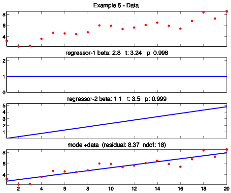
Example 5 is linear regression, GLM style. The data is a collection of (x,y) points; we seek to fit a line through it. The basis functions are a line and a constant function. The results look a little more like typical linear regression if I plot them 2x2 rather than 4x1 to make the panels square, so I did a second model and plotted it 2x2:
I've specified the basis functions as having slope one and a constant value of one. I could have used any values -- all it would change is the value of the weights. For example, specifying a slope of two for the first basis function would halve the first weight, and specifying a slope of one-half would double it. Sometimes this comes back to bite you -- for example when comparing results across two different analyses. Stay frosty.
In the introduction, I described GLM as combining regression and ANOVA into a unified whole. Example 6 demonstrates my claim. It's a t-test, GLM style, and what is a t-test if not an ANOVA with only two groups? Still, I suspect this looks like no t-test you have ever seen. You probably expect t-test data plotted as a bar graph, with the height and error bar representing the mean and variability of each group. When using GLM, we wrassle t-test data into a contrived time-series format.
Here's the idea: Picture collecting data for your study. Each day, you add another sample to the data, and mark a "1" or a "2" in your notebook to indicate whether the data came from a group-1 subject or group-2 subject. (Add a zero to the data and in your notebook if no data were collected on a given day.) When you are done collecting data, convert your notebook of 0s and 1s and 2s into two indicator vectors. Entries in the first indicator vector are equal to one on days you collected data from a group-1 subject and zero otherwise. Entries in the second indicator vector are equal to one on days you collected data from a group-2 subject and zero otherwise. Those are your basis functions. Feed them (and the data) to GLM.
GLM don't care that the basis functions look funky, it just fits them. Viola! We obtain the model shown in the bottom panel, and t-test statistics to go with it. I've defined the data in this example so that the group-2 treatment creates a larger effect than the group-1 treatment. But the data are also noisy. Is the effect significant? The numbers say YES. We'll get to statistical testing soon.
Footnote: I use Matlab's "stem plot" function here because the results look nicer for indicator-type regressors.
Here's the t-test again, except I sorted the data to make it look a little more like a traditional t-test. I put all of group-1 in the first half of data and all of group-2 in the second half. If you squint, the stem plots look like two bar graphs. This is probably how you expect to see t-test data plotted (all that is missing are error bars).
If two groups gets us a t-test, then more than two groups must be ANOVA. And so it is. Example 7 is one-factor ANOVA, GLM style. Assume the data represents an effect measured in three different treatment groups. I provide a basis function for each. We obtain the model shown in the bottom panel, and statistics to go with it. The results look similar to the t-test example, except with more groups.
Footnote: ANOVA may seem like a rote extension of t-testing, but broaching the ANOVA-GLM connection opens a rather Brobdingnagian can of worms. I shall side-step these here (because Primer). However, I'll point you to some competent treatments in the Recommended Reading.
Combining basis functions (aka regressors) and superimposing them on data hopefully seems straightforward enough. However, you may have noticed I didn't explain how we obtain the weights, nor the statistics used to test them. Thus do we see the true summit of GLM rising in the distance: statistical testing. To scale that, we first need to look at the equations behind the magic.
The Equations of GLM
I have been remiss in defining what "best fit" means. In GLM, it means minimizing the square of the difference between the data and the model -- what I have been calling the residual. (This concept is familiar if you have performed a "least-squares" regression.) We need the equations that do so. These are surprisingly easy to write down.
Let's attack this head on. We seek a weighted combination of basis functions (bk) that generates the data (d):
d = β1 b1 + β2 b2 + ... + βm bm [ Eq. 1 ]
here, d and each bk is an n x 1 vector; n is the number of data points and m is the number of basis functions you defined in your model. (I'll use italics lowercase letters for scalars and bold lowercase letters for vectors.) We seek all the βk.
Arrange the weights βk into an m x 1 vector β and the basis functions bk into an n x m matrix B. (I'll use bold uppercase letters for matrices.) We can then write Eq. 1 as:
d = B β [ Eq. 2 ]
The data (d) and basis functions (B) are given. We want to compute the weights (β). No problemo, you say. Invert B and extract β. Except there is a big problemo: B isn't square. It has as many rows as there are data points, as many columns as there are basis functions, and, typically, m << n. Ergo, B doesn't have an inverse.
It appears we are screwed. Are we?
No, we are not. Multiply both sides of Eq. 2 by the transpose of B:
BT d = BTB β [ Eq. 3 ]
Note BTB is square (the product of the transpose of any matrix times itself is a square matrix). Therefore, BTB probably* has an inverse (*qualification to follow). Ergo, multiply both sides of Eq. 3 by said inverse:
(BTB)-1 BT d = (BTB)-1(BTB) β [ Eq. 4 ]
The first two terms on the RHS cancel. After rearranging, we're left with:
β = (BTB)-1BTd [ Eq. 5 ]
And that's it. You get the weights using a little matrix algebra. I would have guessed it was insanely more complicated. Complicated like pick an initial guess for the weights, obtain a tentative model, then use some conjugate gradient blah-blah to iteratively find weights that minimize the residual. Nope. The fact that the weights fall out of a straightforward matrix equation is just the delightful cherry on top of the GLM sundae.
Footnote: Most textbooks use y (not d) for the data and X (not B) for the basis functions. They would write Eq. 5 as β = (XTX)-1XTy, or, to be pedantic, β̂ = (XTX)-1XTy. (There should be a little hat drawn over β in that last expression. If there isn't, my tawdry HTML trick didn't work on your browser.) The hat means estimate (in the statistical sense). We obtain an "estimate" because the equation ignores the noise in the data. Recall we began with d = B β. The true equation is d = B β + ε, where ε is an n x 1 vector of normally-distributed noise. By ignoring the noise, the weights we obtain are an estimate (in the statistical sense) of the true weights -- specifically, a least squares estimate.
Footnote: Some textbooks use uppercase Y to emphasize the data is a random variable. Whatever. I like uppercase for matrices. I also like d (not y) for the data and B (not X) for the basis functions because it makes the equations easier to parse at a glance. N is for "mnemonic"!
Footnote: I haven't proven Eq. 5 provides the least-squares weights, I've merely written down a little matrix algebra. The proof comes in recognizing what I've written is the matrix version of the normal equations. Any competent stats book will explain the connection.
The Design Matrix
The matrix B (or X, in most textbooks) is called the design matrix. You will frequently see a design matrix displayed graphically. Here's the idea: Previously, we plotted a basis function as a waveform. Instead, we can plot it as a grayscale image, with black representing the minimum value (often 0) and white representing the maximum value (often 1). Apply this to the columns of the design matrix. Viola! Graphical display.
I used this trick to plot the design matrix for each of the example models we looked at earlier:
Note added in proof: The design matrix I plotted here for the t-test (Ex. 6) and the ANOVA (Ex. 7) are from a different analysis run than I showed earlier, so the group assignments are different than those shown in Fig. 6 and 8 (because they are randomized). If you try to compare them, you will get confused. Tut mir leid.
One final hiccup: I noted the matrix BTB is probably invertible. Bad news: Sometimes it isn't. Good news: You have control over this. The invertibility of BTB is a question of the basis functions you select. If the ones you select aren't independent (stupid example: include the same basis function twice in your model) then the code is going to barf up a cheese Whopper when it tries to invert BTB. So don't do that.
Statistical Testing
Making models that fit data might feel good, but our goal isn't pretty pictures, it's statistics. We want to claim a basis function we thunk up is present in our data, and back up that claim with cold hard numbers. For this we turn to an old friend: the t-test.
Applying the t-test in GLM gives us an opportunity to really think about statistical testing. What is a statistical test? A statistical test is always always always: a value penalized by variability. A signal-to-noise ratio.
Pop Quiz: In which pair below are the groups statistically different?

You cannot answer the question, because I have not provided you all the information. What's missing is the variability of the data. Variability is typically depicted using error bars:

The asterisk indicates the statistically significant difference. At left: small effect, but significant because the noise is negligible. Think: kitten mewing in a morgue. At right, large effect, but not significant because the noise is substantial. Think: chainsaw at a Van Halen concert (I use "noise" here in the signal-processing sense, not in the my-dad sense. Eddie's sublime shredding comprised the soundtrack of my misspent youth).
Value. Penalized. By. Variability. In statistics, the penalizing variability is called the standard error. Capisce?
Tacking our boat back to the topic at hand, we wish to t-test a β. Ergo, we test a value penalized by variability. In a t-test, this is written as the quotient:
t-value = β / se(β)
I've introduced the notation se( ) to indicate standard error. (Also, as above, the β should have a little hat over it but I suspect that HTML ship has sailed.) This tests β against 0 (e.g., H0: β=0, to use proper null hypothesis notation). We can test against any value we like, but most of the time we test against zero. A regressor with a zero weight doesn't contribute to our model and so it is uninteresting.
You know the drill: Compute the t-value, then check whether it exceeds some critical value using software or old-school table lookup at the back of the book (or, back of the envelope: | t | > 3 is prolly significant -- the ole' plus-or-minus three sigma dealio). Boom! Done.
Except I haven't told you se(β). A formal derivation is surprisingly gnarly (you can look it up elsewhere), so imma just write it down. However, just writing it down requires some custom GLM notation. Meet contrasts.
Contrasts
Because we often include many (many) regressors in a model, statistical testing in GLM is usually formulated using vector notation. We pick out a weight of interest, or combinations of them, using a vector of cleverly-arranged constants. The clever vector is called a contrast vector and the statistical test it generates is called a contrast.
Because I'm sure that made no sense, let's consider a few examples. First, a note on notation. A "vector" is a column of numbers, but formatting a column in HTML is a pain in the fur. Ergo, I will write out vectors as a row of numbers. Furthermore, I will indicate dot product by putting a dot between them. So if a = [ 1 2 ] and b = [ 3 4 ] then I will write the dot product of a and b as [ 1 2 ] • [ 3 4 ] (recall dot product is just the sum of the product of corresponding terms -- (1)(3) + (2)(4) = 11 in this example). Later, I will write the dot product of a and b as aT b, which is actually the correct way to do it.
Let's push on.
When we applied GLM to linear regression, we obtained two weights (slope β1 and y-intercept β2). Arrange these into a vector [ β1 β2 ]. Now, if we want to refer to β1, we dot the vector [ 1 0 ] with the weight vector:
β1 = [ 1 0 ] • [ β1 β2 ]
If we want to refer to β2, we dot the vector [ 0 1 ] with the weight vector:
β2 = [ 0 1 ] • [ β1 β2 ]
If we want to refer to the difference of β1 and β2, we dot the vector [ 1 -1 ] with the weight vector:
β1−β2 = [ 1 -1 ] • [ β1 β2 ]
If we want to refer to the average of the weights, we dot the vector [ 0.5 0.5 ] with the weight vector:
(β1+β2) / 2 = [ 0.5 0.5 ] • [ β1 β2 ]
I think you get the idea.
The vector [ 1 0 ] is a contrast. The vector [ 0 1 ] is a contrast. The vector [ 1 -1 ] is a contrast. The vector [ 0.5 0.5 ] is a contrast. (Technically, contrast vectors, but such terminology abuse is common.) They are a convenient tool for extracting weights or combination of weights.
What does this buy us? Statistical testing. The four contrasts above let us test, respectively, H0: β1 = 0, H0: β2 = 0, H0: β1 − β2 = 0, and H0: mean(β1,β2) = 0.
How do we test a contrast? Value penalized by variability:
t-value = cTβ / se(cTβ) [ Eq. 6 ]
Here, c is any contrast vector, and:
se(cTβ) = √ [ σ2 cT (XTX)-1 c ] [ Eq. 7 ]
The model variance σ2 is estimated using:
σ2 = (y − Xβ)T(y − Xβ) / ndof [ Eq. 8 ]
where ndof = n−m (um, sort of. See footnote). Recall y is the data and Xβ is the model, so (y − Xβ) is the difference between the model and the data, so the dot product (y − Xβ)T(y − Xβ) is the sum of the square of the differences, aka the residual. (I've surrendered to textbook X and y notation because it might help you recognize these equations elsewhere). Dividing the residual by the degrees of freedom gives mean square error. Taking the square root (cf. Eq. 7) gives us a standard error.
Easy peasy. However, as always, there are footnotes.
Footnote: The number of degrees of freedom (ndof) is actually a little more complicated than n−m. Recall n is the number of data points and m is the number of regressors. I noted earlier that a design matrix can include regressors that are not independent (in the linear algebra sense). In a simple model, the solution is: don't do that. In a real-world model (see next section), it can be unavoidable. Regardless, we must only count independent regressors when computing degrees of freedom. This is given by the rank of X. Ergo, the true ndof = n−rank(X). If all the regressors are independent, then rank(X) = m, and ndof = n−m, as I wrote above. Otherwise, it is not. Note this issue isn't specific to GLM; it's as old as regression, where it goes under the moniker "multicollinearity."
Footnote: Since we're airing dirty laundry, I should mention if your data are serially correlated (time series data often are), it can also create problems for GLM. This issue is also as old as regression, where is goes under the moniker "your data are serially correlated." The solution is something called pre-whitening. Google will lead you to more information.
Footnote: I have assumed "testing" means t-test. However, an F-test is also sometimes used in GLM. The difference? The short answer is the t-test is one-sided (i.e., is the contrast > 0?) and the F-test is two-sided (i.e., is the contrast =/= 0?). The long answer is there's additional blah-blah using an F-test introduces. See: Recommended Reading.
Footnote: Some people insist the entries in a contrast vector must sum to one (if the entries are all positive) or zero (if there's a mix of positive and negative entries). Doing so isn't essential (it's just scaling), but GLM connoisseurs may look at your results funny if you don't.
Footnote: Testing the difference of two weights, or two collections of them, is the métier of contrasts. I used the example [ 1 -1 ] above. Although this can test H0: β1 − β2 = 0, we more likely use a one-sided test, so the null hypothesis becomes H0: β1 − β2 > 0. Obviously, this is the same thing as testing β1 > β1, which is how it is usually written (i.e., with a ">"). GLM applications are typically chocked-full of this form of contrast.
Contrasts are overkill for testing two parameters in a dinky linear regression, but they become very useful for organizing statistical testing in models containing dozens or hundreds or thousands of regressors. Wait, what? Thousands of regressors? Why would anyone include so many regressors? How many can you use? How many should you use? And how do you invent regressors to put in a model in the first place?
Fair questions, all. The answers involve both art and science.
The Art and Science of Regressor Selection
Where do regressors come from?
Presumably, you have some idea what GLM should look for in your your data otherwise you would be using a different tool. For example, you suspect -- whatever might be contaminating it -- there should be a square wave present. This because you understand the process that generated the data. Perhaps the data is the return signal of a radar system, and you know a the receiver should receive a square wave because you know the emitter emitted one. Perhaps the signal is a square wave broadcast by an orbiting satellite and recorded by ground telemetry. Perhaps the signal is brain activity measured in a subject during a series of stimulus-on/stimulus-off conditions, and that seems like the sort of thing that should result in a square wave pattern in the data.
In each of these examples, we can supply a square wave as a basis function and GLM will attempt to use it in the model. Clearly, the square wave should have the proper frequency and phase. The proper frequency and phase might be obvious, but there can be not-so-obvious confounding factors. By the time our receiver receives it, our pristine square wave radar signal might have gotten distorted by dispersion. Our satellite signal might be warped by atmospheric interference. Our expected square wave brain response might be mangled by neuron dynamics. The solution is always the same: Study the underlying system and craft a more accurate basis function. However, a system is not always easy to understand. Sometimes you just do the best you can.
How good is good enough? The goal is always statistical significance. We want a big t-value for our regressors. There's two ways to make a t-value bigger: 1) bigger effect (the numerator in Eq. 6), 2) smaller residual (the denominator in Eq. 6). You make the effect bigger by picking good regressors. You make the residual smaller by picking good regressors. Supplying the most accurate regressor for the signal(s) of interest is critical. However, just as important is supplying nuisance regressors that model the noise. We don't care about modeling the noise per se; we just want to get it out of the way. The nuisance regressors fall on their swords, so to speak, clearing a path for the regressors of interest to bask in the glory of statistical significance.
There's not much you can do about random noise, but systematic noise should be assigned a regressor whenever possible. For example, systematic noise can be a DC offset in the measurement. Ergo, supply a constant basis function so GLM can account for it. Systemic noise can be a slow drift of the signal over the measurement interval. Ergo, supply a linear basis function so that GLM will use it rather than bending a regressor of interest. Systematic noise can be 60 Hz buzz from the power supply. Ergo, supply a 60 Hz sinusoid as a basis function so GLM can remove its contribution. The more of the uninteresting variation in the data you can soak up, the smaller the denominator in Eq. 6 and the more likely the t-value for an effect of interest will reach significance.
The beauty of GLM is you can include as many regressors in your model as you like. GLM will use, ignore, or combine these as it sees fit. The only penalty is each additional regressor reduces the model degrees of freedom by one. This makes it harder to reach significance, all else being equal, but only slightly so. The trade-off is generally worth it. Occasionally the penalty is BTB is not invertible. However, there are ways to work around this (using a Moore-Penrose inverse, for example). Furthermore, this doesn't depend on the data; it depends on the selection of the regressors. Selection of the regressors depends on the modeler. The modeler is you.
Footnote: I should be a little less cavalier in re the invertibility of the design matrix. The problem is a Moore-Penrose inverse isn't unique. Often, a model that isn't unique isn't useful. One place this crops up is ANOVA, where auxiliary equations are sometimes required to nail things down. See Recommended Reading.
There's not much more I can do except provide code to play with.
MATLAB code
Here's the Matlab scripts I used to generate the examples I showed earlier. I've left various blocks commented out or not; hopefully it's self-explanatory which block generates which example. There might even be a few bonus models.
The workhorse is my function GLMPlot( ). This takes a title string, flags indicating whether to use stem plots and whether to plot the design matrix, then comes the data and a variable number of regressors. The function crunches the numbers and generates the graphics shown in the examples; it will also optionally plot the design matrix in a separate window. I get the t-value for each regressor using Eq. 6. I get the p of the t-value using betainc (the incomplete beta function) because that is how the t-distribution is defined. This does a one-sided test.
I've tested my code by the Old Gods and the New (Matlab 5.0 and R2016b, respectively) but, as always, let me know if you find any bugs.
% Ex 1 -- data = model = square wave
t = [0.02:0.02:1];
data = square(4*2*pi*t)+0.1*randn(size(t));
r1 = square(4*2*pi*t);
GLMPlot('Example 1 - Data', 0, 1, data, r1);
% % Ex 2 -- Squarewave+Offset+Trend+Noise
%
% t = [0.01:0.02:1];
% signal = square(4*2*pi*t);
% offset = ones(size(t));
% trend = t;
% noise = 0.2 * randn(size(t));
% data = signal + offset + 5 * trend + noise;
% GLMPlot('Ex 2 - Data ', 0, 1, data, signal, offset, trend);
% % Ex 3 -- Model 2 minus trend regressor
%
% t = [0.01:0.02:1];
% signal = square(4*2*pi*t);
% offset = ones(size(t));
% trend = t;
% noise = 0.2 * randn(size(t));
% data = signal + offset + 5 * trend + noise;
% GLMPlot('Ex 3 - Data ', 0, 1, data, signal, offset);
% % Ex 4 -- Bad Regressors
%
% t = [0.01:0.02:1];
% signal = square(4*2*pi*t);
% offset = ones(size(t));
% trend = t;
% noise = 0.2 * randn(size(t));
% data = signal + offset + 5 * trend + noise;
% r1 = sin(1*2*pi*t);
% r2 = cos(1*2*pi*t);
% GLMPlot('Ex 4 - Data', 0, 1, data, r1,r2);
% % Ex 5 -- Linear Regression
%
% t = [0.01:0.05:1];
% offset = ones(size(t));
% trend = 5 * t;
% noise = .5 * randn(size(t));
% data = 3 * offset + trend + noise;
% r1 = offset;
% r2 = 1*trend;
% GLMPlot('Ex 5 - Data', 0, 1, data, r1, r2);
% % Ex 6 -- t-test
%
% t = [0.01:0.01:1];
% group1 = rand(size(t))>0.9;
% group2 = rand(size(t)) > 0.9;
% badoverlap = find((group1+group2)>1);
% group1(badoverlap) = 0;
% group2(badoverlap) = 0;
% data = group1 + 2*group2 + 0.1*randn(size(t));
% r1 = group1;
% r2 = group2;
% GLMPlot('Ex 6 - Data', 1, 1, data, r1, r2);
% % Ex 6b -- t-test (sorted nice)
%
% t = [1:100];
% group1 = zeros(1,100);
% group2 = zeros(1,100);
% group1(25:35) = 1;
% group2(65:75) = 1;
% data = group1 + 2*group2 + 0.1*randn(size(t));
% r1 = group1;
% r2 = group2;
% GLMPlot('Ex 6b - Data', 1, 1, data, r1, r2);
% % Ex 7 -- ANOVA
%
% t = [0.01:0.01:1];
% group1 = rand(size(t))>0.9;
% group2 = rand(size(t)) > 0.9;
% group3 = rand(size(t)) > 0.9;
% badoverlap = find((group1+group2+group3)>1);
% group1(badoverlap) = 0;
% group2(badoverlap) = 0;
% group3(badoverlap) = 0;
% data = group1 + 2*group2 + 3*group3 + 0.1*randn(size(t));
% r1 = group1;
% r2 = group2;
% r3 = group3;
% GLMPlot('Ex 7 - Data', 1, 1, data, r1, r2, r3);
% % Bonus! -- Fourier, GLM style
%
% t = [0.01:0.05:1];
% s1 = sin(2*pi*t);
% c1 = cos(2*pi*t);
% s2 = sin(20*pi*t);
% data = 2*s1 + s2;
% GLMPlot('Fourier - Data ', 0, 1, data, s1, c1);
% % Bonus! -- A larger Fourier
%
% t = [0.01:0.05:1];
% dc = ones(size(t));
% c1 = cos(2*pi*t);
% s2 = sin(3*pi*t);
% c2 = cos(3*pi*t);
% s3 = sin(4*pi*t);
% c3 = cos(4*pi*t);
% data = 1 + 2*s1 + c3;
% GLMPlot('Fourier - Data ', 0, 1, data, dc, s1,c1,s2,c2,s3,c3);
function GLMPlot(mainTitle, stemplot, plotDM, data, varargin)
%
% run a GLM, plot results
%
% mainTitle string goes at top of figure
% if stemplot == 1 plot as a stemplot
% (good for t-test and anova models)
% if plotDM == 1, then the design matrix is
% plotted in a separate window
%
% data = data
% varargin = regressors
%
% ----------------------------------------
% build design matrix
% ----------------------------------------
nRegressors = length(varargin);
X = [ ];
for index = 1:nRegressors
X = [ X varargin{index}' ];
end
% -----------------------------------------
% calculate
% -----------------------------------------
XTXinv = inv(X' * X);
beta = XTXinv * X' * data';
model = X * beta;
residual = (data' - model)' * (data' - model);
ndof = length(data) - rank(X);
sigma2 = (residual' * residual ) / ndof;
t_value = zeros(nRegressors,1);
p_value = zeros(nRegressors,1);
for index =1:nRegressors
c = zeros(nRegressors,1);
c(index) = 1;
se = sqrt(sigma2 * c' * (XTXinv) * c);
t = c' * beta / se;
t_value(index) = t;
temp = 1-betainc(ndof/(ndof+t^2), ndof/2, 0.5);
p_value(index) = 1-(1-temp)/2;
end
% -------------------------------------------
% plot
% -------------------------------------------
FS = 12; % good font size
nPanels = nRegressors+2;
figure(1);clf;
subplot(nPanels, 1, 1);
h=plot(data,'ro');
set(h,' MarkerSize', 4, 'MarkerFaceColor', 'r');
axis tight;
a=axis;axis([a(1) a(2) 1.5*a(3) 1.5*a(4)]);
save_a = axis;
title(mainTitle,'FontSize',FS);
set(gca,'XTickLabel',[]);
for index = 1:nRegressors
subplot(nPanels, 1, index+1);
if (stemplot)
h = stem(varargin{index});
set(h, 'MarkerSize', 4, 'MarkerFaceColor', 'b');
else
h=plot(varargin{index});
set(h,'LineWidth',2);
end
axis tight;
a=axis;axis([a(1) a(2) 1.5*a(3) 1.5*a(4)]);
label = [ ' regressor-' num2str(index) ];
bs = num2str(beta(index),2);
ts = num2str(t_value(index),3);
ps = num2str(p_value(index),3);
ht=title([label ' beta: ' bs ' t: ' ts ' p: ' ps ],'FontSize',FS);
set(gca,'XTickLabel',[]);
set(ht,'VerticalAlignment','baseline');
end
subplot(nPanels, 1, nPanels)
if (stemplot)
h = stem(model);
set(h,'MarkerSize',4,'MarkerFaceColor','b');
else
h=plot(model);
set(h,'LineWidth',2);
end
hold on;
h=plot(data,'ro');
set(h,'MarkerSize',4,'MarkerFaceColor','r');
axis(save_a);
rs = num2str(residual,3);
ns = num2str(ndof) ;
ht=title(['model+data (residual: ' rs ' ndof: ' ns ')'],'FontSize',FS);
set(ht,'VerticalAlignment','baseline');
% -------------------------------------------
% plot design matrix?
% -------------------------------------------
if (plotDM)
figure
% the result looks nicer if we
% widen the columns a bit
X = kron(X,ones(1,2));
temp = max(X);
temp = ones(size(X,1),1)*temp;
imagesc(X./temp);
view(0,90);
colormap gray;
axis equal;
axis off
end
Recommended Reading
t = [0.02:0.02:1];
data = square(4*2*pi*t)+0.1*randn(size(t));
r1 = square(4*2*pi*t);
GLMPlot('Example 1 - Data', 0, 1, data, r1);
% % Ex 2 -- Squarewave+Offset+Trend+Noise
%
% t = [0.01:0.02:1];
% signal = square(4*2*pi*t);
% offset = ones(size(t));
% trend = t;
% noise = 0.2 * randn(size(t));
% data = signal + offset + 5 * trend + noise;
% GLMPlot('Ex 2 - Data ', 0, 1, data, signal, offset, trend);
% % Ex 3 -- Model 2 minus trend regressor
%
% t = [0.01:0.02:1];
% signal = square(4*2*pi*t);
% offset = ones(size(t));
% trend = t;
% noise = 0.2 * randn(size(t));
% data = signal + offset + 5 * trend + noise;
% GLMPlot('Ex 3 - Data ', 0, 1, data, signal, offset);
% % Ex 4 -- Bad Regressors
%
% t = [0.01:0.02:1];
% signal = square(4*2*pi*t);
% offset = ones(size(t));
% trend = t;
% noise = 0.2 * randn(size(t));
% data = signal + offset + 5 * trend + noise;
% r1 = sin(1*2*pi*t);
% r2 = cos(1*2*pi*t);
% GLMPlot('Ex 4 - Data', 0, 1, data, r1,r2);
% % Ex 5 -- Linear Regression
%
% t = [0.01:0.05:1];
% offset = ones(size(t));
% trend = 5 * t;
% noise = .5 * randn(size(t));
% data = 3 * offset + trend + noise;
% r1 = offset;
% r2 = 1*trend;
% GLMPlot('Ex 5 - Data', 0, 1, data, r1, r2);
% % Ex 6 -- t-test
%
% t = [0.01:0.01:1];
% group1 = rand(size(t))>0.9;
% group2 = rand(size(t)) > 0.9;
% badoverlap = find((group1+group2)>1);
% group1(badoverlap) = 0;
% group2(badoverlap) = 0;
% data = group1 + 2*group2 + 0.1*randn(size(t));
% r1 = group1;
% r2 = group2;
% GLMPlot('Ex 6 - Data', 1, 1, data, r1, r2);
% % Ex 6b -- t-test (sorted nice)
%
% t = [1:100];
% group1 = zeros(1,100);
% group2 = zeros(1,100);
% group1(25:35) = 1;
% group2(65:75) = 1;
% data = group1 + 2*group2 + 0.1*randn(size(t));
% r1 = group1;
% r2 = group2;
% GLMPlot('Ex 6b - Data', 1, 1, data, r1, r2);
% % Ex 7 -- ANOVA
%
% t = [0.01:0.01:1];
% group1 = rand(size(t))>0.9;
% group2 = rand(size(t)) > 0.9;
% group3 = rand(size(t)) > 0.9;
% badoverlap = find((group1+group2+group3)>1);
% group1(badoverlap) = 0;
% group2(badoverlap) = 0;
% group3(badoverlap) = 0;
% data = group1 + 2*group2 + 3*group3 + 0.1*randn(size(t));
% r1 = group1;
% r2 = group2;
% r3 = group3;
% GLMPlot('Ex 7 - Data', 1, 1, data, r1, r2, r3);
% % Bonus! -- Fourier, GLM style
%
% t = [0.01:0.05:1];
% s1 = sin(2*pi*t);
% c1 = cos(2*pi*t);
% s2 = sin(20*pi*t);
% data = 2*s1 + s2;
% GLMPlot('Fourier - Data ', 0, 1, data, s1, c1);
% % Bonus! -- A larger Fourier
%
% t = [0.01:0.05:1];
% dc = ones(size(t));
% c1 = cos(2*pi*t);
% s2 = sin(3*pi*t);
% c2 = cos(3*pi*t);
% s3 = sin(4*pi*t);
% c3 = cos(4*pi*t);
% data = 1 + 2*s1 + c3;
% GLMPlot('Fourier - Data ', 0, 1, data, dc, s1,c1,s2,c2,s3,c3);
function GLMPlot(mainTitle, stemplot, plotDM, data, varargin)
%
% run a GLM, plot results
%
% mainTitle string goes at top of figure
% if stemplot == 1 plot as a stemplot
% (good for t-test and anova models)
% if plotDM == 1, then the design matrix is
% plotted in a separate window
%
% data = data
% varargin = regressors
%
% ----------------------------------------
% build design matrix
% ----------------------------------------
nRegressors = length(varargin);
X = [ ];
for index = 1:nRegressors
X = [ X varargin{index}' ];
end
% -----------------------------------------
% calculate
% -----------------------------------------
XTXinv = inv(X' * X);
beta = XTXinv * X' * data';
model = X * beta;
residual = (data' - model)' * (data' - model);
ndof = length(data) - rank(X);
sigma2 = (residual' * residual ) / ndof;
t_value = zeros(nRegressors,1);
p_value = zeros(nRegressors,1);
for index =1:nRegressors
c = zeros(nRegressors,1);
c(index) = 1;
se = sqrt(sigma2 * c' * (XTXinv) * c);
t = c' * beta / se;
t_value(index) = t;
temp = 1-betainc(ndof/(ndof+t^2), ndof/2, 0.5);
p_value(index) = 1-(1-temp)/2;
end
% -------------------------------------------
% plot
% -------------------------------------------
FS = 12; % good font size
nPanels = nRegressors+2;
figure(1);clf;
subplot(nPanels, 1, 1);
h=plot(data,'ro');
set(h,' MarkerSize', 4, 'MarkerFaceColor', 'r');
axis tight;
a=axis;axis([a(1) a(2) 1.5*a(3) 1.5*a(4)]);
save_a = axis;
title(mainTitle,'FontSize',FS);
set(gca,'XTickLabel',[]);
for index = 1:nRegressors
subplot(nPanels, 1, index+1);
if (stemplot)
h = stem(varargin{index});
set(h, 'MarkerSize', 4, 'MarkerFaceColor', 'b');
else
h=plot(varargin{index});
set(h,'LineWidth',2);
end
axis tight;
a=axis;axis([a(1) a(2) 1.5*a(3) 1.5*a(4)]);
label = [ ' regressor-' num2str(index) ];
bs = num2str(beta(index),2);
ts = num2str(t_value(index),3);
ps = num2str(p_value(index),3);
ht=title([label ' beta: ' bs ' t: ' ts ' p: ' ps ],'FontSize',FS);
set(gca,'XTickLabel',[]);
set(ht,'VerticalAlignment','baseline');
end
subplot(nPanels, 1, nPanels)
if (stemplot)
h = stem(model);
set(h,'MarkerSize',4,'MarkerFaceColor','b');
else
h=plot(model);
set(h,'LineWidth',2);
end
hold on;
h=plot(data,'ro');
set(h,'MarkerSize',4,'MarkerFaceColor','r');
axis(save_a);
rs = num2str(residual,3);
ns = num2str(ndof) ;
ht=title(['model+data (residual: ' rs ' ndof: ' ns ')'],'FontSize',FS);
set(ht,'VerticalAlignment','baseline');
% -------------------------------------------
% plot design matrix?
% -------------------------------------------
if (plotDM)
figure
% the result looks nicer if we
% widen the columns a bit
X = kron(X,ones(1,2));
temp = max(X);
temp = ones(size(X,1),1)*temp;
imagesc(X./temp);
view(0,90);
colormap gray;
axis equal;
axis off
end
GLM is something of a black sheep in the statistics literature. The lion's share of textbooks still present regression and ANOVA as separate topics and only mention GLM in passing if at all. An opposing faction believes this approach should be jettisoned, but the replacement they invariably reach for is the GeneraliZED linear model, which includes complications we don't require. This leaves the beginning student between a rock and a hard place. It's like Mr. Miyagi said to Danielson: You do GLM yes, okay. You do GLM no, okay. You do GLM think-so? Squashed like grape. (In this context, "GLM" refers to the GeneraliZED linear model, so GLM yes would mean learning the more difficult tool, GLM no means sticking with the a separate-topics approach, and GLM think-so refers to learning the General Linear Model. Here we have an example of how explaining a joke kills the joke.)
As such, your best bet might be to find a field that has taken GLM to its bosom and look to them for all your GLM reading needs. The field that leaps to mind is fMRI -- indeed, it's been said* functional magnetic resonance imaging is just GLM wrapped in a fifty million dollar superconducting magnet (*it's possible this has not really been said). A massive literature exists on applying GLM to model brain function. Textbooks are the best place to start.
If you insist on perusing the statistics section of your library for GLM, I'm afraid I'm not much help. People keep pointing me to Neter's Applied Linear Statistical Models. His presentation is clear and comprehensive (my third edition clocks in at over a thousand pages). It also has little to do with GLM. To me, Neter reads like a standard statistics book, albeit one that is very well written (and very long). Matrix equations occasionally appear, but overall his book is basically Zar sans Zar's footnote fetish. Still, it's a good reference to keep handy for many of Neter's explanations and insights into regression and ANOVA, even if he never does combine these into a unified whole.
Finally, I would direct your attention to Regression, ANOVA, and the General Linear Model: A Statistics Primer by Peter Vik. The cover blurb describes the book as "...juxtaposing the two approaches by presenting a traditional approach in one chapter, followed by the same analysis demonstrated using GLM." This makes me very eager to read it. However, last time I checked Amazon, the going price was around $100. This makes me less eager to buy it. Perhaps Dr. Vik can send me a desk copy so I can say nice things about him. For now, I'll only note his book was published in 2013, which should give you some indication there is still a market for GLM treatments aimed at the beginner. Some of these primers are rather expensive; some of these primers are given away for free by crazy people on the Internet.
Note added in proof: I stumbled upon a small GLM textbook treasure trove in the final days of working on your primer (the secret for finding books on GLM is to avoid using "GLM" as a search term. Go figure). I'm currently liking Monahan's A Primer on Linear Models, which is reasonably thin (and reasonably priced). I also found many helpful tidbits in Rencher's Linear Models in Statistics. Both Monahan and Rencher employ the mathozoid theorem/proof approach, which usually gets my fur puffy but not irredeemably so here. Of the two, Monahan is the more inclined to wander off into unnecessary obfuscation (representative example: Monahan introduces Lagrange multipliers by way of continuously differentiable mappings. I introduce Lagrange multipliers by way of the dress Donny Kerobotsos' sister wore to my Calc II final). Overall, however, he remains relatively readable.
No comments:
Post a Comment